Most Eruptions

That’s right, eruptions, not interruptions. We’re talking volcanoes here.

This week’s TidyTuesday theme for R Programming data analysis was on volcanoes, and volcanic eruptions. Data was provided by the Smithsonian Institute.

  • Did you know all known volcanoes in the world have an official “Volcano Number”?
  • Did you know that not all volcanic eruptions are confirmed?

For example, since 2000 there have been 794 recorded eruptions, but of these 79 are unconfirmed (about 10%). That’s pretty surprising considering these recently occurred. Perhaps they occurred in very remote regions (like on an unpopulated island in the middle of the Pacific Ocean), or there was dispute if some volcanic activity was considered an “eruption” or not.

Which do you think are the top three countries with confirmed volcanic eruptions since 2000?

Japan came to my mind, but I wasn’t sure about the rest. Maybe Chile or Argentina…

it turns out, Indonesia (30), Japan (15), USA (14) have had the most confirmed eruptions recently!

The top recent “eruptors” bear very interesting names, like:

  1. Piton de la Fournaise
  2. San Cristobal
  3. Klyuchevsky
  1. Chikurachki

Some of these have erupted 22 times in the past 20 years!

You can check out my volcano github post to see more curiosities I analyzed and the actual R programming code I used. I got to learn & practice using some new functions from the dplyr package like:

inner_join(), which combines columns from both datasets in the result
semi_join(), which shows only columns from the first specified dataset
anti_join(), which keeps only the first dataset’s columns like in semi_join() but feels more rebellious to use

I found this dplyr site helpful in helping me figure out how to use these functions and see which ones fit my analysis needs.

At first, I was bummed that the topic was on “Volcanoes” after a fun whirl on Animal Crossing. However, this analysis turned out to be fun and the time quickly erupted by!

TidyTuesday Tidbits from Animal Crossing

There is a popular video game captivating folks at home these days called “Animal Crossing”. When I first heard this, I imagined animals crossing a road to get to the other side, like the old game Frog Xing or Frogger. Alas, the game has nothing to do with crossing busy traffic roads!

“Animal Crossing” is a Japanese game whose original title (Doubutsu No Mori どうぶつの森) translates to something more like “Animal Forest”. From what I gather, it’s a SIMs-like game where you build up an island, interacting with both virtual (in-game) and real characters (actual people). My friend was totally unfazed when I showed her a picture of fish whose face only a mother could love (aka a Sculpin) because she’d grown accustomed to catching valuable tarantulas by night and selling them by day for the game. A rather strange-sounding way to make money…

Every Tuesday, some wonderful people share an interesting data set that becomes a source of data analysis. It’s a great way to practice “data wrangling” – that is, filtering, cleaning, and taking care of problematic data in a quest to tame it, understand it, and find some interesting insights. It’s called #TidyTuesday and comes with a fresh dataset, background information, and article that makes use of the data. This past Tuesday the data just so happened to pertain to Animal Crossing!

The “Tidy” aspect of “TidyTuesday” refers to ‘cleaning’ or ‘tidying’ the data. In R Programming, there’s a package called the “Tidyverse” that comes with many tools and enhanced functions great for tidying data. Why on Tuesday? I’m not sure, but it does add a spark of excitement to this day of the week for me. #TidyFriday or #TidyThursday wouldn’t sound bad, either.

This week’s Animal Crossing data included stats on all of the villagers (computer characters) on the island and items that can be bought/sold. There’s a plethora of information on each, like a villager’s personality type, birthday, and theme song! I decided to practice my R data wrangling skills while answering curiosities that popped into my mind as I examined this data.

(Check out my github site for the full analysis & R code, which I’ll update every Tuesday as I’m able!)

Items Analysis

# Analysis 1: Which items can be bought with ‘miles’ and then sold for bells?
# Answer: 19 “Nook Inc” items from the Nook Miles System. Not the e-reader Nook, from the Tanuki character Tom Nook.

items_miles % filter(buy_currency == "miles" & sell_currency == "bells")
view(items_miles)

# Analysis 2: Which ‘items’ give the highest profit (sell minus buy value)?
# Answer: None. All items have a sell_value < buy_value.
I guess you can’t sell things for more than you bought them for…

# Analysis 3: Which items have a greatest difference between buy and sell value?
# Answer: Royal Crown, Crown, Gold Armor, Golden Casket (?!?), Grand Piano

items_bells % filter(buy_currency == "bells" & sell_currency == "bells")
items_bells %>% filter(sell_value > buy_value)
# Create value difference column and add to items_bells table
value_dif <- items_bells$buy_value - items_bells$sell_value items_bells$value_dif % top_n(wt = value_dif, n = 5) # Done!! Expand Console width to view last col. The trick was to create the value_dif in a new column and add it to the table. top_n(items_bells %>% filter(buy_value > sell_value), n = 5)

My question is…is a Golden Casket really what I think it is? Who would use this?? (I can only think of one person, who is rumored to have a golden toilet).

…oh! It’s real! (The casket is in the lower left corner, I believe.)

Golden Casket 1

# Analysis 4: Which category of items is the most expensive?
# Furniture, Hats, Bugs
# Cheapest: Flowers, Fruit, Photos, Socks, Tools

items_bells %>%
group_by(category) %>%
dplyr::summarize_at(vars(buy_value, sell_value), funs(mean(., na.rm = TRUE)))

Villagers Analysis

# Analysis 5: Are there more male or female characters?
# Answer: 187 Females, 204 males! Slightly more males!
# count() does group_by() + tally() https://dplyr.tidyverse.org/reference/tally.html
villagers %>%
count(gender)

# Analysis 6: Which Personality Types are the most common?
# Answer: Lazy, Normal, Cranky/Jock/Snooty, Peppy

# Analysis 6b:Are there any personality types with only 1 character?
# Nope! But the least common type is ‘uchi’ (a translation of “sisterly/big sister” in Japanese).

villagers %>%
count(personality) %>%
arrange(desc(n))

Uchi

To be honest…Agnes the black pig scares me…

# Analysis 7: Who has their own song?
# Four special villagers have their own song: Angus, Diva, Gwen, and Zell.

villagers %>%
add_count(song) %>%
filter(n == 1)

# Analysis 8: Who has a birthday today (5/6)?
# Answer: Tank the Rhino! He looks cuter than I imagined from his name.

villagers %>%
filter(birthday == "5-6")

Tank Rhino

Mandela on Liberating the Oppressor

I walk around my neighborhood every day, and like discovering Little Free Libraries. These little nooks and crannies are packed with books donated by any passerby, and it’s always a surprise what you’ll find!

Littlefreelibrary

I picked up a book called “The Best of Personal Excellence (Volume 2)” edited by Ken Shelton. It’s anthology of 2-page excerpts from well-known figures, entrepreneurs and life coaches. The cover design and font looks a bit dated, and was published in 1999. But on the top of the contributing authors list was “Nelson Mandela”, so I was intrigued. I know little about this great man, and the little I know is mainly through Trevor Noah — not exactly the most professional source, but a valid one nonetheless.


The Best of Personal Excellence (Magazine of Life Enrichment) (Volume 2)

There are about 20 authors listed on the cover. Nelson Mandela appears first, but his excerpt is embedded later. I didn’t look up what page and let it come as a surprise. Lo and behold, when it appeared, it certainly delivered!

“During those long and lonely years, my hunger for the freedom of my own people became a hunger for the freedom of all people.

The oppressor must be liberated just as surely as the oppressed. A man who takes away another’s freedom is a prisoner of hatred; he is locked behind the bars of prejudice and narrow-mindedness. The oppressed and the oppressor alike are robbed of their humanity.”

(This excerpt, from “The Best of Personal Excellence” volume 2, is originally from Mandela’s book Long Walk to Freedom.)

When I hold a grudge against someone, I have a hard time focusing or sleeping well because the negative thoughts and feelings eat me up. I want to forgive sincerely, so I harbor this grudge longer. This often leads to extended suffering, however. The oppressor is shackled too, in a different way than the oppressed but still severely.

Though hard, I am learning how important it is to forgive more easily. This liberates both the oppressor and the oppressed.

The Lines and Dots that Make Us

This post title plays on Nathan Vass’s book, but doesn’t have to do with Seattle bus transportation!

I’ve been studying how to use R programming for data analysis. We learned about the “geometry” layer of creating graphs using a neat function called ggplot(), from the ggplot2 package. (In case you wondered like me, ‘gg’ stands for Grammar of Graphics, which is a book written about data visualization. Nothing to do with Gigi’s nor gee’s). Compared to using graphing functions like matplot() (“matrix plot”) that come standard in “base R”, graphing tools from packages created by others tend to take care of a lot of details that would be cumbersome to set manually.

We took a set of 562 American movies spanning many genres from 2007-2011, their Rotten Tomatoes ratings (from critics and public audience) and budget in dollars. The following shows how Critic versus Audience ratings compared, by genre (color) and budget (line thickness & dot size, millions of dollars).

Movies lines dots
ggplot: Critic vs Audience Movie Ratings, by genre and budget, 2007-2011. Created using R programming.

Isn’t this graph crazy? Like rainbow paint was splashed everywhere. This left me wondering what is the point of having a graph with lines overlaid above dots like this? It’s hard to distinguish between line strokes and dots, not to mention its not at all necessary to ‘connect the dots’ with geom_line’s.

That’s when I started creating a different graph. I have this banana plant that is unfurling long, luscious green leaves, each one bigger than the next. I counted each leaf (number 1 being the first/oldest, and smallest leaf), and measured the length in centimeters. Ultimately I’d like to create a predictive model (comparing regression versus machine learning) to forecast how long the next leaf will be. Anyways, seeing this graph, this is a case where having lines and dots isn’t so chaotic, and actually aesthetically makes sense.

Banano Line and Dots
Banana plant leaf length. Created using R programming.

The lesson here is that combining both geometric points and lines – geom_line() + geom_point() is better suited when:

  • Dots and their connecting lines are distinct colors
  • Lines are not so thick that the dots are hard to distinguish
  • Generally speaking, that it makes sense to have a reason to draw lines (to emphasize trends, for example).

None of these were the case with the movies graph – so while it may be worthy of being displayed in an art museum, the simpler Banana Growth graph makes a much better use of ggplot geometric dots and lines.

Words from the Cafe: Bang Nguyen

I’ve been reading an anthology of short stories & poems from Seattle’s Recovery Cafe writing program. One of the authors is a Vietnamese refugee who came to Seattle when he was 4 years old. His poignant prose and themes struck me, particular in this passage:

Bang Nguyen

“Not My Brother”, from Another American Dream

We started out the same. Born in the same coastal city in Vietnam,
the sons of sisters from our mothers’ side. Refugees on the same boat
in the same graduating class, got jobs,
and began climbing the corporate ladder.

We were more like brothers than cousins.

But somehow, I couldn’t keep climbing.
It seemed the higher I climbed the more the burden
of guilt weighted on me for my executive decisions.
Did I say execute?
I felt like a financial hit man. A corporate bankster.
Everything started to look slick on me.
Slick hair. Slick suits. Slick style.
I was fast becoming a corporate burnout,
my business life an infamous two pots of coffee morning,
two martini lunch, and way more than two hours of happy hour
each and every day.

I got caught in a rung, and fell off the corporate ladder.

Unlike me, Cousin showed no sign of cracking…

This passage transports me back to when I used to do consulting, donning pressed shirts and slacks, corporate badge on retractable clip on my right belt-loop, neat rows of office desks and computers, directors taking out their anger on their managers, managers onto their senior associates, and eventually associates onto the innocent taxi drivers, hotel staff, cafe barista, or whomever else they could shed off some stress. It was a hard world of great pay but great stress that often didn’t make sense. I didn’t climb high onto this ladder, but I didn’t like the cynical person I was becoming. I eventually decided to climb off the rungs and restore myself in a different lifestyle in Peru.

The book is called “Words from the Cafe: An Anthology”. Bang Nguyen and the other authors come from myriad walks of life, but their stories all touch the heart deeply from their life events and wisdom.

Words From the Cafe: An Anthology

Macadamia & Sesame Coffee

Today at Grocery Outlet (Crown Hill, Seattle), I discovered two interesting accompaniments to duet with coffee:

1. Milkadamia brand’s Macadamia nut Coffee Creamer, “Fudge Flavor”

This creamer pours out with thick, rich cocoa promises. I mixed it with coffee and some sesame milk and it has a nice mocha flavor.

The first (and only) coffee creamer I’ve tried was Trader Joe’s Soy Creamer. This is a sweet creamer with lots of vegetable oils whipped in so that it gives coffee a nice, full (fatty) body like dairy creamer. I’ve been curious about trying other plant-based creamers for a while and for $1.99 (16 fl oz or 0.47L, this was worth trying! Note that this is not sweet so you can control the sweetness level by adding sugar to your liking.

2. Hope & Sesame Organic Sesame Milk, Original Flavor

I enjoy trying out plant-based milks, and have tried & made many including Soy, Oat, Hemp, Almond, Cashew, Pecan, Walnut, Rice, and Quinoa. However, Sesame milk was a new find! Hope Sesame Milk is made from a combination of Sesame and Pea protein (so it’s not purely sesame + water). I’m a big fan of sesame seeds, oil and tahini so was curious how this would taste.

The sesame milk has a strong, nutty flavor and a fine but discernible grainy texture. It’s sort of like oat milk, but the grains are suspended throughout the milk and don’t seem to collect/fall to the bottom. Honestly I wouldn’t know it was made of sesame in a blind taste-test.

It’s much thicker and richer than rice milk. The “Original” version has a distinct flavor, sort of like vanilla.

I’d recommend this sesame milk for the daring, but don’t expect a strong toasted-sesame flavor! This was also $1.99 at Grocery Outlet (Crown Hill) for a 1L carton.

Box and Whiskers

Remember ‘box and whisker’ plots? Along the same vein as ‘stem and leaf’, these are a type of plot learned in school to show the distribution or spread of data, but I’d be stunned if you, dear reader, have actually made use of these outside of math class. Please comment if you have had the honor!

I’ve done a number of statistical analyses for school and tutoring, but I’ve yet to encounter a situation where a good old box and whisker rises as the best contender to display data.

Nonetheless, I learned to make one by coding in R today.
We’re working with a set of data showing the popularity of google-searching the term “entrepreneur” by state. The data has been standardized so that a state with an ‘entrepreneur’ value of 0 is at the mean; a positive value means ‘entrepreneur’ was googled relatively more than average. A negative value means that ‘entrepreneur’ was googled relatively less than average.

Out of the box, the boxplot() function is quite bare.

05_02 Out of the Box Boxplot
Out of the Box boxplot()

No titles, no labels! Those are premium services!
Curiously, the outlier ‘circle’ on the right, around 2.55, is actually TWO data points but they overlap and appear as one. I discovered this only upon summoning some descriptive statistics in the console viewer using:

boxplot.stats(df$entrepreneur)

So, let’s:
– Label the descriptive statistics (min, max, quartiles) and outlier
– Make the labels a fun color while at it


# Boxplot with Quartile Labels

boxplot(df$entrepreneur,
notch = F, horizontal = T,
main = “Distribution of Googling ‘Entrepreneur’ by State”,
xlab = “Standard Deviations”)

text(x = fivenum(df$entrepreneur),
labels = fivenum(df$entrepreneur),
y = 1.25,
col = “#990066”)

05_02 Boxplot Googling Entrepreneur by State and Color Quartile Labels

Concluding here, and next steps:
– It looks like the fivenum() five number summary considers the outliers as the max, so the max whisker is not labelled.
– I’d like to label the outlier with the State Abbreviations (any guesses?)

Thanks for reading!

* The outliers are DE and UT! Surprised?

Crazy Impoverished Asians

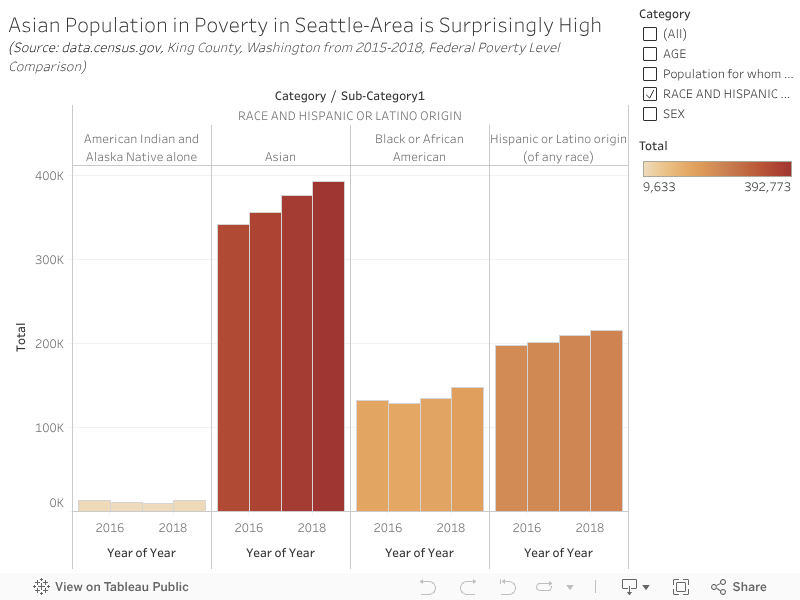
Who knew that the most impoverished minority race group in King County (containing Seattle) are Asians? The number of Asians living under the federal poverty line is significantly greater than Latinos, Blacks, and Native Americans. I was surprised when looking at Census Bureau data from 2015-2018. Hover over and interact with this Tableau visualization or “viz” to see the numbers.

At the two Seattle Food Banks I visited, I noticed there were a considerable number of elderly Chinese folks. However, I found this result to be surprising!

Click on the preview image below to access the Tableau viz and stats.

As of now, WordPress doesn’t let fully embedded Tableau graphics onto posts.
WordPress, please get on this!

The Lines that Make Us

Poignant lines from Nathan Vass’s book of bus driver stories (pages 117-118). Remember to brace yourself and put your best self forward!

I recall thinking, Whoever gets out there first on Rainier Avenue is going to get annihilated. Aside from a mass of overload, what passenger on this green earth is going to be happy, waiting 90 to 120 minutes for a bus that normally comes every fifteen? Whoever that poor soul of a driver is who gets out there first…

Only later did I realize: I am going to be that operator. I didn’t plan it that way; it just happened. I happened to get to Twelfth and Jackson before anyone else did and saw the angry mob. Grab this bull by the horns, I told myself, and dive in. Anything else would be too easy. You were made for stuff like this.

These folks were furious.

They didn’t have the tech access to know why the bus was late or what had been going on. They’d just be seething, for an hour plus…

Speak loudly, confidently, kindly — Thank you for waiting, thanks for your patience, I appreciate your patience tonight…

With this and other similar interactions, we turned the night around. Grab the bull by the horns, and make it happen. It was exhilarating.

43766792-10108354658648998-483145440972242944-n_1

Nathan Vass is a Seattle bus driver who writes a great blog and published a book with a collection of stories and photography.

Once, at the downtown Seattle Public Library, I saw a curly mop of hair and light-blue collared shirt running up the yellow escalators. He exuded a great aura of energy & cheer that wasn’t normal. I suspected it was Nathan. Without thinking, I raced up the escalators in order to catch him between floors 7 & 8, but alas lost sight of him amidst the labyrinth of bookshelves. I still think it was him.

f9f2e49436c02d197946eda32c0e514c

The Great French Press

If you enjoy using a french press to brew coffee, I’d like to suggest a veritable alternative to Bodum-brand French Press. Behold, the Ikea UPPHETTA French Press!

Traits to look for in a good french press:

  • Durable glass beaker than can withstand daily use, hand washing, and boiling hot water temperatures. Think Pyrex-glass, but more delicate. “Borosilicate” glass does the job well.
  • Separable metal filter/screen pieces that can be washed by hand. Cheaper models tend to have the pieces screwed or welded permanently together, so coffee granules can get trapped between the screen pieces and never fully removed.

Ikea French Press

Bodum makes a great 1L press, but they can cost upwards of $20-30.
While perusing kitchenwares  at Ikea, I found a $8 humble press that, lo and behold, bore the above traits and has been holding up exceptionally well with near-daily use these past few months!

The lid was taped shut against the carafe with a clear piece of tape. I wasn’t able to tell if the metal filter/screen pieces were separable, but discovered upon bringing the press home that they indeed were!

French presses are also great for brewing loose-leaf tea. The design allows the tea to swim around in the carafe and get maximum surface area exposure to the hot water.

I highly recommend Ikea’s UPPHETTA French Press if you’re looking for a cheaper alternative of good quality to Bodum presses.