Stop immediately, not after

Something in that boggles me is why range(a, b) in Python includes the a value, but not b. In math, range(a, b) implies neither a nor b are included – the parentheses are exclusive. Square brackets – range[a, b] – are inclusive. So why is Python’s range(a, b) part inclusive, part exclusive? It doesn’t follow the math rules I’d expect.

I did some research and came across this snippet:

Python range is inclusive because it starts with the first argument of the range() method, but it does not end with the second argument of the range() method; it ends with the end – 1 index. The reason is zero-based indexing.

https://appdividend.com/2021/03/24/python-range-inclusive/

Now I have a lead, but still want to understand: How does zero-based indexing affect range inclusion? Here’s an explanation that made things *click* for me.

I think it may help to add some simple ‘real life’ reasoning as to why it works this way, which I have found useful when introducing the subject to young newcomers:

With something like ‘range(1,10)’ confusion can arise from thinking that pair of parameters represents the “start and end”.

It is actually start and “stop”.

Now, if it were the “end” value then, yes, you might expect that number would be included as the final entry in the sequence. But it is not the “end”.

Others mistakenly call that parameter “count” because if you only ever use ‘range(n)’ then it does, of course, iterate ‘n’ times. This logic breaks down when you add the start parameter.

So the key point is to remember its name: “stop“. That means it is the point at which, when reached, iteration will stop immediately. Not after that point.

So, while “start” does indeed represent the first value to be included, on reaching the “stop” value it ‘breaks’ rather than continuing to process ‘that one as well’ before stopping.

One analogy that I have used in explaining this to kids is that, ironically, it is better behaved than kids! It doesn’t stop after it supposed to – it stops immediately without finishing what it was doing. (They get this 😉 )

Another analogy – when you drive a car you don’t pass a stop/yield/’give way’ sign and end up with it sitting somewhere next to, or behind, your car. Technically you still haven’t reached it when you do stop. It is not included in the ‘things you passed on your journey’.

User dingles – https://stackoverflow.com/questions/4504662/why-does-rangestart-end-not-include-end

It makes more sense now. Python’s range(a, b) starts iterating at a and stops at b – right when it hits b, so that it does not include it.

Onward with learning, kids!

To cluck or not to cluck

I’ve been coding! Like the slow erosion of a river forming a canyon, I am steadily pecking away at Python to become a better programmer. Here is a lil project I did today. Why chickens? I’ll explain in a future post. Stay tuned! Bok bok bok!

# Magic 8 Ball - Ask a question, reveal an answer.

import random

name = "Heeju"

question = "Should I get hens this weekend?"

answer = ""
answer_2 = ""

# First question random answer generation
random_number = random.randint(1,10)

if random_number == 1:
  answer = "Yes - definitely."
elif random_number == 2:
  answer = "It is decidedly so."
elif random_number == 3:
  answer = "Without a doubt."
elif random_number == 4:
  answer = "Reply hazy, try again."
elif random_number == 5:
  answer = "Ask again later."
elif random_number == 6:
  answer = "Better not to tell you now."
elif random_number == 7:
  answer = "My sources say no."
elif random_number == 8:
  answer = "Outlook not so good."
elif random_number == 9:
  answer = "Very doubtful."
elif random_number == 10:
  answer = "Don't rush it. Give it some time."
else:
  answer = "Error (number outside of range)"

# Second question random answer generation

random_number_2 = random.randint(1,9)
if random_number_2 == 1:
  answer_2 = "Yes - definitely."
elif random_number_2 == 2:
  answer_2 = "It is decidedly so."
elif random_number_2 == 3:
  answer_2 = "Without a doubt."
elif random_number_2 == 4:
  answer_2 = "Reply hazy, try again."
elif random_number_2 == 5:
  answer_2 = "Ask again later."
elif random_number_2 == 6:
  answer_2 = "Better not to tell you now."
elif random_number_2 == 7:
  answer_2 = "My sources say no."
elif random_number_2 == 8:
  answer_2 = "Outlook not so good."
elif random_number_2 == 9:
  answer_2 = "Very doubtful."
else:
  answer_2 = "Error (number outside of range)"


if question == "":
  print("You didn't ask a question. Please ask one!")
elif name == "":
  print(question)
elif name != "":
  print(name,"asks:", question)
else:
  print(name,"asks:", question)


print("Magic 8-ball's answer:", answer)

print("Is this truly random?", answer_2)

The great reveal:

Garden Zone

As part of my Python programming practice, I came up with a module and function that randomly generates 5 USDA Plant Hardiness Zones / Garden Zones.

def randomgardenzone():
    test_list = ['a', 'b']
    for i in range(1, 5+1):
        x = randint(1, 13)
        res = choice(test_list)
        print(x, res)

randomgardenzone()

For context: the US Department of Agriculture has 13 designated “zones” for the country, based on the average annual min temperature. Each zone number is 10 degrees F apart. There is a further subdivision of zones with a letter ‘a’ or ‘b’, where ‘b’ is 5 degrees F warmer than ‘a’.

These zones are useful for gardeners because we can confidently plant specimens that are hardy (cold/frost/freezing temperature tolerant) to their zone. This is why mango and bananas don’t grow in Minnesota, while they may thrive in a Floridian garden. The Minnesotan would have to have a toasty heated greenhouse in order to cultivate mango trees or bananas through their winter. (Did you know the banana plant is actually an herb, not a tree?)

I’m curious how some plants are able to be cold-hardy and resist freezing. When it gets below 32’F, the water in the plant cells wants to freeze and expand. This would rupture the cell walls and make the plant loose its structure, becoming frost damaged, mushy, and sadly, not salvageable. I heard that cold-hardy plants contain a natural antifreeze that prevents this. I’m curious how antifreeze works, and if it’s similar to what’s used in automobiles. Dianthus is an example of a common plant that is cold-hardy (you can grow them in Alaska), and in fact they need a cold season in order to thrive.

Python Things I learned:

  • Use “for i in range(1, 5)”, not just “for i in (1,5)”. A simple doh!-type mistake!
  • range(a, b) works like [a, b) – it is exclusive of the b value. However, randint(a, b) is inclusive of the b value.
  • The “choice( )” function from the random module let’s you pick a random item from a list. This was useful to pick the zone letters ‘a’ or ‘b’, since randint( ) is only used to pick a random integer.

“I don’t know where to start”

This guy Zook has a great noggin and head.

I’m reading “Own Your Weird” by Jason Zook, and want to share this golden nugget with you. Maybe it’ll lift you up if you’re embarking on a hard quest like me (like learning computer programming, for real this time, or reducing material consumption/living minimally and realizing how much is “enough”):

“Our brains have this mystical, magical, commanding power over us. It can be incredibly difficult to challenge our own thoughts. Even if we have data from other sources, we often still can’t get past our own mental barriers.

Assumptions about starting your next business/project/whatever:

I’m amazed at how often I hear from people who are talking themselves out of being successful…[with] phrases like:

“I don’t know where to start.”

By picking up this book, you are starting. By wanting to start, you are starting. So check that one off the list right now. But you know those things aren’t enough. Eventually, you just have to put one foot in front of the other (or click a mouse one click in front of the other?). Start small, start scared, but just start.

Most Eruptions

That’s right, eruptions, not interruptions. We’re talking volcanoes here.

This week’s TidyTuesday theme for R Programming data analysis was on volcanoes, and volcanic eruptions. Data was provided by the Smithsonian Institute.

  • Did you know all known volcanoes in the world have an official “Volcano Number”?
  • Did you know that not all volcanic eruptions are confirmed?

For example, since 2000 there have been 794 recorded eruptions, but of these 79 are unconfirmed (about 10%). That’s pretty surprising considering these recently occurred. Perhaps they occurred in very remote regions (like on an unpopulated island in the middle of the Pacific Ocean), or there was dispute if some volcanic activity was considered an “eruption” or not.

Which do you think are the top three countries with confirmed volcanic eruptions since 2000?

Japan came to my mind, but I wasn’t sure about the rest. Maybe Chile or Argentina…

it turns out, Indonesia (30), Japan (15), USA (14) have had the most confirmed eruptions recently!

The top recent “eruptors” bear very interesting names, like:

  1. Piton de la Fournaise
  2. San Cristobal
  3. Klyuchevsky
  1. Chikurachki

Some of these have erupted 22 times in the past 20 years!

You can check out my volcano github post to see more curiosities I analyzed and the actual R programming code I used. I got to learn & practice using some new functions from the dplyr package like:

inner_join(), which combines columns from both datasets in the result
semi_join(), which shows only columns from the first specified dataset
anti_join(), which keeps only the first dataset’s columns like in semi_join() but feels more rebellious to use

I found this dplyr site helpful in helping me figure out how to use these functions and see which ones fit my analysis needs.

At first, I was bummed that the topic was on “Volcanoes” after a fun whirl on Animal Crossing. However, this analysis turned out to be fun and the time quickly erupted by!

TidyTuesday Tidbits from Animal Crossing

There is a popular video game captivating folks at home these days called “Animal Crossing”. When I first heard this, I imagined animals crossing a road to get to the other side, like the old game Frog Xing or Frogger. Alas, the game has nothing to do with crossing busy traffic roads!

“Animal Crossing” is a Japanese game whose original title (Doubutsu No Mori どうぶつの森) translates to something more like “Animal Forest”. From what I gather, it’s a SIMs-like game where you build up an island, interacting with both virtual (in-game) and real characters (actual people). My friend was totally unfazed when I showed her a picture of fish whose face only a mother could love (aka a Sculpin) because she’d grown accustomed to catching valuable tarantulas by night and selling them by day for the game. A rather strange-sounding way to make money…

Every Tuesday, some wonderful people share an interesting data set that becomes a source of data analysis. It’s a great way to practice “data wrangling” – that is, filtering, cleaning, and taking care of problematic data in a quest to tame it, understand it, and find some interesting insights. It’s called #TidyTuesday and comes with a fresh dataset, background information, and article that makes use of the data. This past Tuesday the data just so happened to pertain to Animal Crossing!

The “Tidy” aspect of “TidyTuesday” refers to ‘cleaning’ or ‘tidying’ the data. In R Programming, there’s a package called the “Tidyverse” that comes with many tools and enhanced functions great for tidying data. Why on Tuesday? I’m not sure, but it does add a spark of excitement to this day of the week for me. #TidyFriday or #TidyThursday wouldn’t sound bad, either.

This week’s Animal Crossing data included stats on all of the villagers (computer characters) on the island and items that can be bought/sold. There’s a plethora of information on each, like a villager’s personality type, birthday, and theme song! I decided to practice my R data wrangling skills while answering curiosities that popped into my mind as I examined this data.

(Check out my github site for the full analysis & R code, which I’ll update every Tuesday as I’m able!)

Items Analysis

# Analysis 1: Which items can be bought with ‘miles’ and then sold for bells?
# Answer: 19 “Nook Inc” items from the Nook Miles System. Not the e-reader Nook, from the Tanuki character Tom Nook.

items_miles % filter(buy_currency == "miles" & sell_currency == "bells")
view(items_miles)

# Analysis 2: Which ‘items’ give the highest profit (sell minus buy value)?
# Answer: None. All items have a sell_value < buy_value.
I guess you can’t sell things for more than you bought them for…

# Analysis 3: Which items have a greatest difference between buy and sell value?
# Answer: Royal Crown, Crown, Gold Armor, Golden Casket (?!?), Grand Piano

items_bells % filter(buy_currency == "bells" & sell_currency == "bells")
items_bells %>% filter(sell_value > buy_value)
# Create value difference column and add to items_bells table
value_dif <- items_bells$buy_value - items_bells$sell_value items_bells$value_dif % top_n(wt = value_dif, n = 5) # Done!! Expand Console width to view last col. The trick was to create the value_dif in a new column and add it to the table. top_n(items_bells %>% filter(buy_value > sell_value), n = 5)

My question is…is a Golden Casket really what I think it is? Who would use this?? (I can only think of one person, who is rumored to have a golden toilet).

…oh! It’s real! (The casket is in the lower left corner, I believe.)

Golden Casket 1

# Analysis 4: Which category of items is the most expensive?
# Furniture, Hats, Bugs
# Cheapest: Flowers, Fruit, Photos, Socks, Tools

items_bells %>%
group_by(category) %>%
dplyr::summarize_at(vars(buy_value, sell_value), funs(mean(., na.rm = TRUE)))

Villagers Analysis

# Analysis 5: Are there more male or female characters?
# Answer: 187 Females, 204 males! Slightly more males!
# count() does group_by() + tally() https://dplyr.tidyverse.org/reference/tally.html
villagers %>%
count(gender)

# Analysis 6: Which Personality Types are the most common?
# Answer: Lazy, Normal, Cranky/Jock/Snooty, Peppy

# Analysis 6b:Are there any personality types with only 1 character?
# Nope! But the least common type is ‘uchi’ (a translation of “sisterly/big sister” in Japanese).

villagers %>%
count(personality) %>%
arrange(desc(n))

Uchi

To be honest…Agnes the black pig scares me…

# Analysis 7: Who has their own song?
# Four special villagers have their own song: Angus, Diva, Gwen, and Zell.

villagers %>%
add_count(song) %>%
filter(n == 1)

# Analysis 8: Who has a birthday today (5/6)?
# Answer: Tank the Rhino! He looks cuter than I imagined from his name.

villagers %>%
filter(birthday == "5-6")

Tank Rhino

The Lines and Dots that Make Us

This post title plays on Nathan Vass’s book, but doesn’t have to do with Seattle bus transportation!

I’ve been studying how to use R programming for data analysis. We learned about the “geometry” layer of creating graphs using a neat function called ggplot(), from the ggplot2 package. (In case you wondered like me, ‘gg’ stands for Grammar of Graphics, which is a book written about data visualization. Nothing to do with Gigi’s nor gee’s). Compared to using graphing functions like matplot() (“matrix plot”) that come standard in “base R”, graphing tools from packages created by others tend to take care of a lot of details that would be cumbersome to set manually.

We took a set of 562 American movies spanning many genres from 2007-2011, their Rotten Tomatoes ratings (from critics and public audience) and budget in dollars. The following shows how Critic versus Audience ratings compared, by genre (color) and budget (line thickness & dot size, millions of dollars).

Movies lines dots
ggplot: Critic vs Audience Movie Ratings, by genre and budget, 2007-2011. Created using R programming.

Isn’t this graph crazy? Like rainbow paint was splashed everywhere. This left me wondering what is the point of having a graph with lines overlaid above dots like this? It’s hard to distinguish between line strokes and dots, not to mention its not at all necessary to ‘connect the dots’ with geom_line’s.

That’s when I started creating a different graph. I have this banana plant that is unfurling long, luscious green leaves, each one bigger than the next. I counted each leaf (number 1 being the first/oldest, and smallest leaf), and measured the length in centimeters. Ultimately I’d like to create a predictive model (comparing regression versus machine learning) to forecast how long the next leaf will be. Anyways, seeing this graph, this is a case where having lines and dots isn’t so chaotic, and actually aesthetically makes sense.

Banano Line and Dots
Banana plant leaf length. Created using R programming.

The lesson here is that combining both geometric points and lines – geom_line() + geom_point() is better suited when:

  • Dots and their connecting lines are distinct colors
  • Lines are not so thick that the dots are hard to distinguish
  • Generally speaking, that it makes sense to have a reason to draw lines (to emphasize trends, for example).

None of these were the case with the movies graph – so while it may be worthy of being displayed in an art museum, the simpler Banana Growth graph makes a much better use of ggplot geometric dots and lines.

Box and Whiskers

Remember ‘box and whisker’ plots? Along the same vein as ‘stem and leaf’, these are a type of plot learned in school to show the distribution or spread of data, but I’d be stunned if you, dear reader, have actually made use of these outside of math class. Please comment if you have had the honor!

I’ve done a number of statistical analyses for school and tutoring, but I’ve yet to encounter a situation where a good old box and whisker rises as the best contender to display data.

Nonetheless, I learned to make one by coding in R today.
We’re working with a set of data showing the popularity of google-searching the term “entrepreneur” by state. The data has been standardized so that a state with an ‘entrepreneur’ value of 0 is at the mean; a positive value means ‘entrepreneur’ was googled relatively more than average. A negative value means that ‘entrepreneur’ was googled relatively less than average.

Out of the box, the boxplot() function is quite bare.

05_02 Out of the Box Boxplot
Out of the Box boxplot()

No titles, no labels! Those are premium services!
Curiously, the outlier ‘circle’ on the right, around 2.55, is actually TWO data points but they overlap and appear as one. I discovered this only upon summoning some descriptive statistics in the console viewer using:

boxplot.stats(df$entrepreneur)

So, let’s:
– Label the descriptive statistics (min, max, quartiles) and outlier
– Make the labels a fun color while at it


# Boxplot with Quartile Labels

boxplot(df$entrepreneur,
notch = F, horizontal = T,
main = “Distribution of Googling ‘Entrepreneur’ by State”,
xlab = “Standard Deviations”)

text(x = fivenum(df$entrepreneur),
labels = fivenum(df$entrepreneur),
y = 1.25,
col = “#990066”)

05_02 Boxplot Googling Entrepreneur by State and Color Quartile Labels

Concluding here, and next steps:
– It looks like the fivenum() five number summary considers the outliers as the max, so the max whisker is not labelled.
– I’d like to label the outlier with the State Abbreviations (any guesses?)

Thanks for reading!

* The outliers are DE and UT! Surprised?

Crazy Impoverished Asians

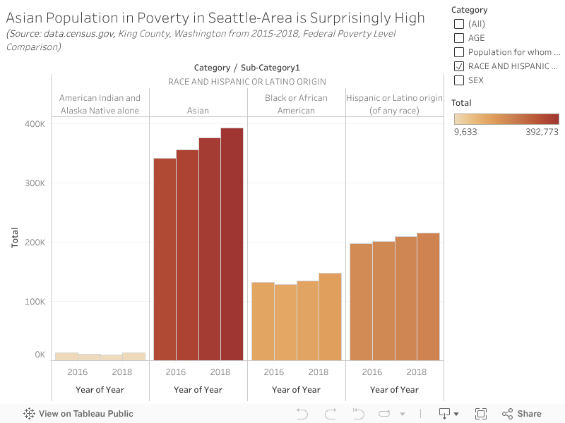
Who knew that the most impoverished minority race group in King County (containing Seattle) are Asians? The number of Asians living under the federal poverty line is significantly greater than Latinos, Blacks, and Native Americans. I was surprised when looking at Census Bureau data from 2015-2018. Hover over and interact with this Tableau visualization or “viz” to see the numbers.

At the two Seattle Food Banks I visited, I noticed there were a considerable number of elderly Chinese folks. However, I found this result to be surprising!

Click on the preview image below to access the Tableau viz and stats.

As of now, WordPress doesn’t let fully embedded Tableau graphics onto posts.
WordPress, please get on this!